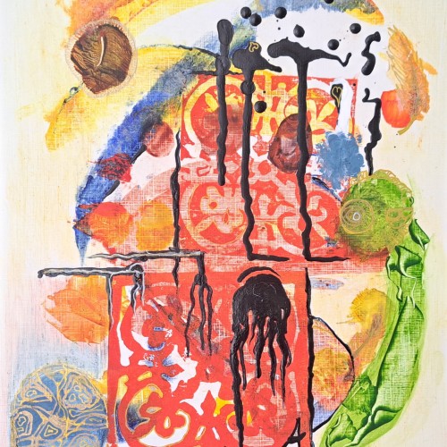
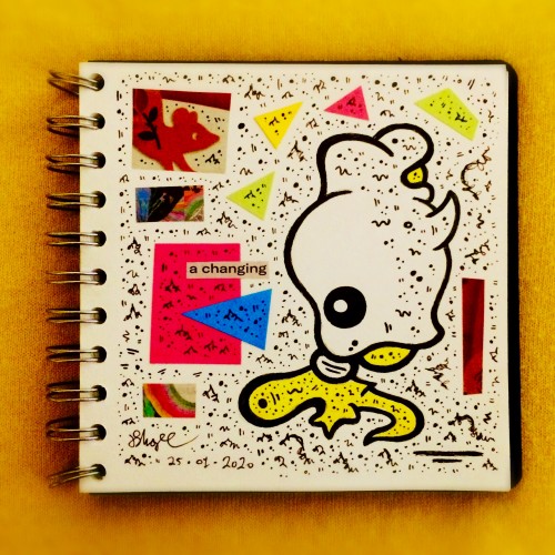
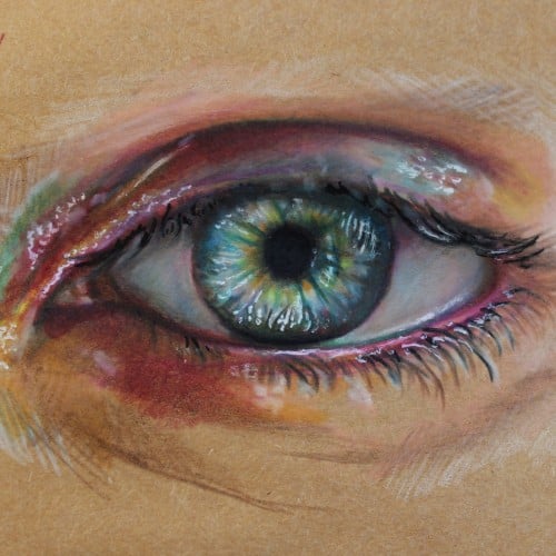
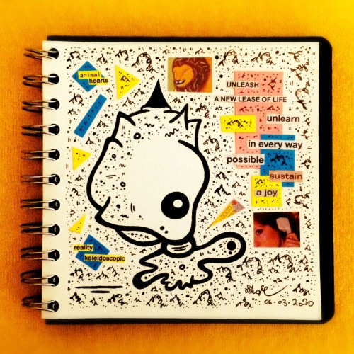
This is based on a couple of lino cut prints, acrylic paint and gold ink. I have rediscovered my love of lino cut printing after many years and hope to do much more of it.
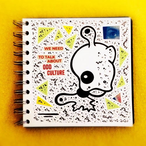
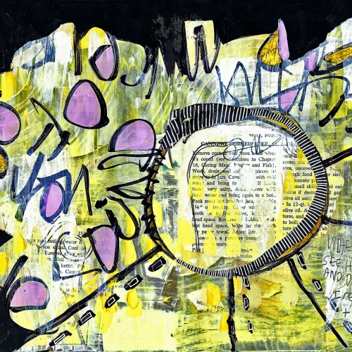
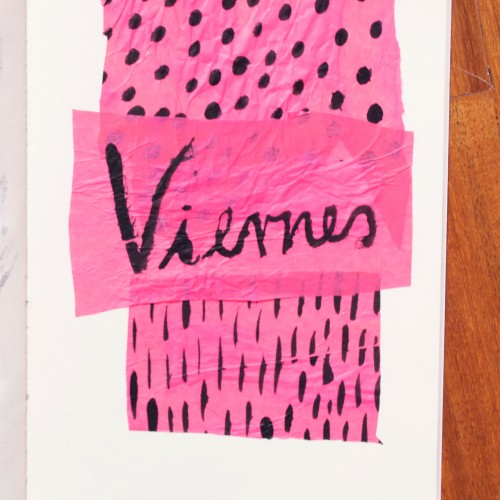
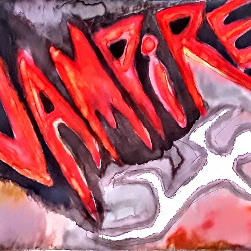
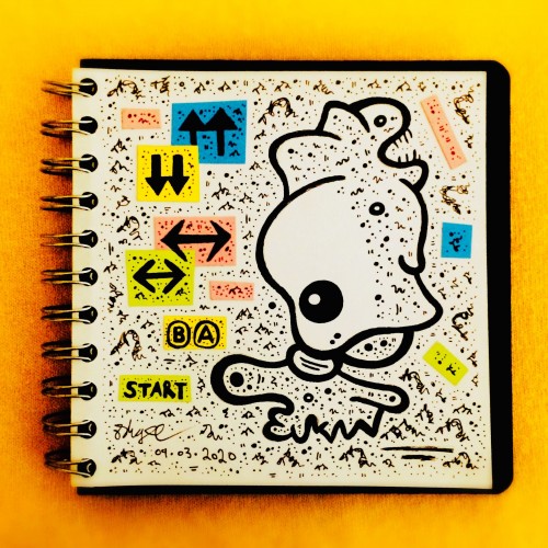
India ink on tissue paper. I had never used ink on this kind of paper before; I really liked the results! There are some folds and wrinkles on the paper that give the pattern some interesting details. The paper is also super absorbing, which plays nicely with the quantities of ink. Since it's very thin, there can easily be overlays between textures. And finally, when trying to use less ink (so that it wouldn't seep through and cause a big dot - the absorbing quality is nice, but it was also somewhat of a challenge!) I used very little ink on the lettering, causing a scratchy, dry look.
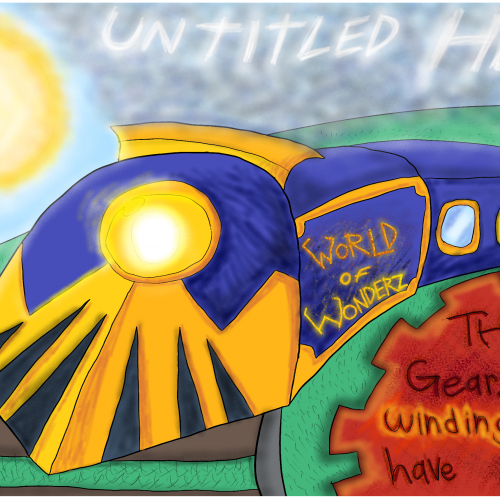
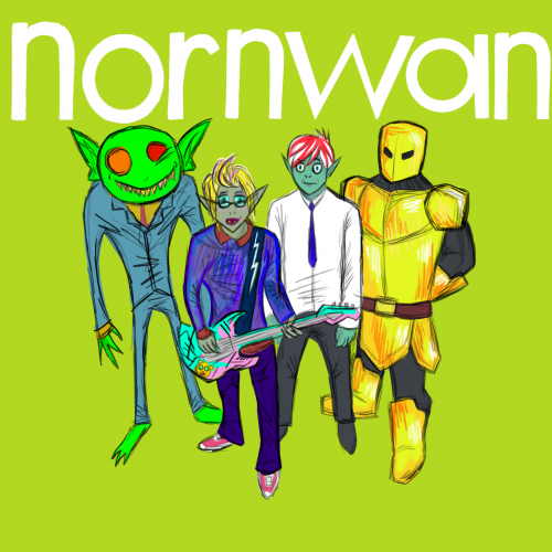
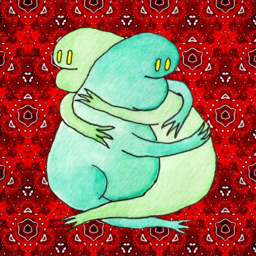
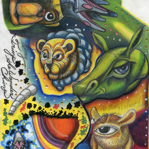
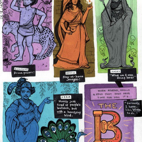
Started as the weekly prompt, but I kinda wandered off track. So instead of drawing yin and yang in opposing colors like I sat down to do, the B-Team happened in secondary colors!
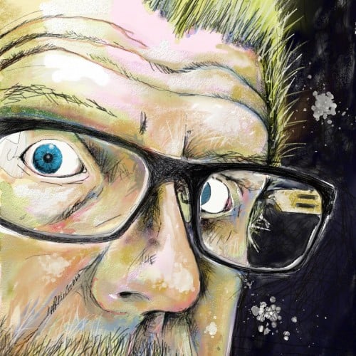
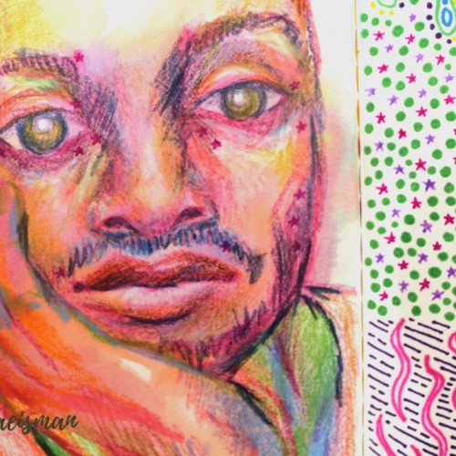
This portrait was created using mixed media like colored pencils, markers, and ink. The portrait features the face of a man resting in his hand, and staring dead-eyed at the viewer. I used non local color techniques to create depth and form using colors not typically found in the human face, like blues and violets for shadows and yellows and oranges or highlights. Parts of his face include small pink stars which originally faded from the previous page, but I really like the look it gives, they almost look like celestial freckles.